%20{%20.cls-1%20{%20fill:%20%23fff;%20}%20}%20%3c/style%3e%3c/defs%3e%3cg%20id='Layer_1-1'%20data-name='Layer%201'%3e%3cg%20id='Layer_1-1'%20data-name='Layer%201-1'%3e%3cpath%20class='cls-1'%20d='m220.77,35.74c2.97,0,3.62,1.09,3.41,3.84-1.09,18.77-14.64,37.69-32.18,43.57-5.87,1.96-12.32,2.83-18.48,3.12-12.61.43-25.23.14-37.84.14-1.59,0-3.19.07-4.71.29-6.09.94-10.22,5.65-10.08,11.53.14,5.87,4.78,10.8,10.87,11.09,5.94.29,11.96-.07,17.9.22,13.77.72,23.78,7.54,29,20.59,8.12,20.22-6.6,42.7-27.98,43.06-11.24.14-22.54.07-33.78.07-8.41,0-10.73,1.88-12.69,10.15-.94,3.77-1.74,7.61-3.04,11.31-6.02,17.11-17.9,27.18-35.59,29.07-9.64,1.01-19.5.14-29.79.14,2.25-10,4.35-19.5,6.52-29,1.88-8.19,3.84-16.31,5.58-24.5,3.26-15.01,13.48-23.7,28.49-23.85,13.77-.14,27.47-.07,41.25-.22,5.44-.07,9.64-3.19,11.09-7.97,1.38-4.35-.07-9.79-3.99-12.25-2.1-1.3-4.78-1.96-7.25-2.32-7.83-1.09-15.87-.94-23.41-2.97-19.21-5-31.53-22.54-30.95-42.48.58-19.93,14.35-37.11,33.27-41.46,3.26-.72,6.67-1.09,10-1.09l114.39-.07h0Z'/%3e%3c/g%3e%3c/g%3e%3c/svg%3e)
· Fabian Schreuder · Business Projects · 6 min read
Unlocking Chatbot Insights: My Journey Building a Performance Dashboard at Foot Locker
Discover the process behind creating a Power BI dashboard to monitor Foot Locker's chatbot performance, focusing on key metrics like deflection rate and escalations, and the valuable lessons learned.
During my time at Foot Locker, I had the exciting opportunity to dive deep into the world of customer interaction data. As chatbots become increasingly central to the customer service experience, understanding their performance isn’t just helpful – it’s critical. Generic metrics weren’t enough; we needed tailored insights to drive real improvements. This led me to develop a comprehensive Chatbot Performance Dashboard using Power BI, a project that was both challenging and incredibly rewarding. This post outlines the hypothetical steps I took and the key learnings I gained along the way.
Setting the Stage: Defining the Need
The first step was understanding what we really needed to know. The goal wasn’t just to track numbers, but to answer core business questions:
- How are customers interacting with our chatbot? (Volume, Trends)
- How effective is the chatbot at resolving issues independently? (Deflection Rate)
- When and why are conversations escalated to human agents? (Escalations, Reasons/Intents)
- Are there performance differences across regions or languages?
- What are the main topics customers ask about? (Contact Drivers/Intents)
- How is performance changing week over week?
Collaborating with stakeholders from Customer Service and the Digital teams was crucial here. We brainstormed key performance indicators (KPIs) that would provide actionable insights. This initial alignment ensured the final dashboard would be relevant and valuable.
Learning: Clear requirements gathering is paramount. Spending time upfront to define the why behind the data prevents building a dashboard that looks good but lacks real utility. Stakeholder buy-in from the start ensures the end product meets business needs.
Wrangling the Data: From Logs to Insights
Next came the data itself. Chatbot interactions generate vast amounts of log data – timestamps, conversation IDs, user inputs, bot responses, detected intents, escalation flags, language codes, geographical indicators, and more.
- Data Sourcing: I identified the primary data sources, primarily the chatbot platform’s logs.
- Extraction & Transformation (ETL): Using Power Query within Power BI, I connected to the sources and began the transformation process. This involved:
- Cleaning the data: Handling missing values, correcting inconsistencies.
- Structuring the data: Creating relationships between different data tables (e.g., conversation details, session logs).
- Feature Engineering: Creating calculated columns vital for analysis, such as flags for ‘IsEscalated’ or ‘IsDeflected’, and parsing timestamps to enable time-based analysis (daily, weekly).
- Defining Metrics: Translating business KPIs into precise calculations. For instance, Deflection Rate = Total Deflected Conversations / Total Conversations. We also tracked metrics like Drop-off Rate and Bot Handled Rate.
- Data Modeling: Organizing the cleaned data into a logical star schema (or similar) within Power BI to optimize performance and simplify DAX calculations.
Learning: Data preparation is often the most time-consuming part of analysis, but it’s the foundation upon which everything else rests. A robust data model makes dashboard development significantly smoother and faster. Understanding the nuances of the source data (e.g., how ‘escalation’ is precisely logged) is critical for accurate metrics.
Building the View: Visualizing Performance in Power BI
With clean, structured data, I moved onto the visualization phase in Power BI. The goal was clarity and interactivity:
- Choosing Visuals: Selecting the right chart for the right data:
- Line Charts: To show trends over time for Total Conversations, Escalations, Deflections, and Deflection Rate.
- Bar/Column Charts: To compare metrics across categories like Region (APAC, EMEA, NA) or Top Contact Drivers (Intents). A combo chart was used to show Escalations vs. Deflections over time.
- KPI Cards/Gauges: For at-a-glance metrics like overall Deflection Rate.
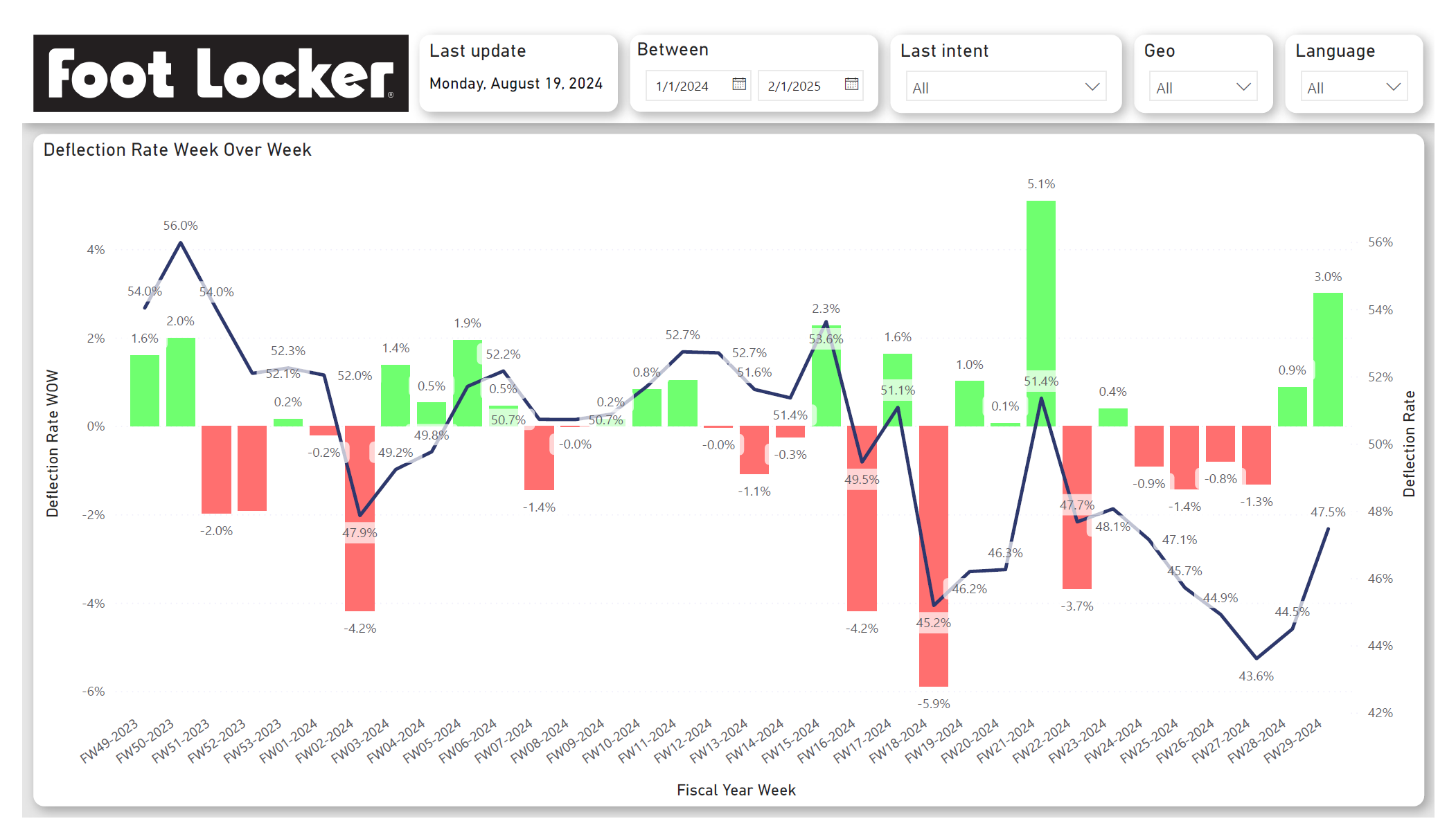
- Tables/Matrices: To provide detailed, granular views, especially for week-over-week performance changes across various KPIs (Conversations, Deflections, Deflection Rate, Drop-off Rate, etc.) and breakdowns by intent or language.
- Layout & Design: Organizing the visuals across multiple dashboard pages/tabs for logical flow. Keeping a consistent colour scheme and clear labelling.
- Interactivity: Implementing slicers for Date Range, Geo, Language, and Last Intent. This allows users to dynamically filter the entire dashboard and explore the data relevant to them. Cross-filtering between visuals was also enabled.
Learning: Effective data visualization is about storytelling. The dashboard shouldn’t just present data; it should guide the user towards insights. Interactivity empowers users to ask and answer their own questions, making the tool much more powerful. Less is often more – avoid cluttering the view.
Uncovering Insights & Driving Action
The dashboard quickly started revealing patterns:
- Trend Analysis: We could easily spot peaks and troughs in conversation volume, correlating them with marketing campaigns or seasonal events. We could also monitor the overall trend in Deflection Rate.
- Performance Diagnostics: Drilling down into the WoW table allowed us to quickly see where metrics were improving or declining. For example, a sudden drop in Deflection Rate for a specific Fiscal Week (e.g., FW21-2024 showing a jump, FW22 showing a drop) prompted investigation into potential chatbot logic changes or emerging customer issues.
- Intent Analysis: The “Top 10 Contact Drivers” visualization highlighted the most common reasons customers were contacting us (e.g., “Order Status / Shipped Status”, “Delivery issues”). Tracking the performance metrics (like Deflection Rate) for specific intents helped identify areas where the chatbot struggled and needed improvement.
- Regional Differences: Slicing by Geo revealed variations in performance and customer behaviour across APAC, EMEA, and NA, suggesting the need for region-specific chatbot tuning.
Learning: The dashboard is a starting point, not an endpoint. Its true value lies in the questions it sparks and the investigations it enables. Regularly reviewing the data and discussing the findings with relevant teams is crucial for driving action.
Deployment and Iteration
Once the initial version was ready, it was published to the Power BI service, making it accessible to stakeholders. Feedback was gathered, leading to minor adjustments and refinements. A dashboard like this is never truly “finished”; it evolves with the business needs and the underlying systems. Future iterations could involve integrating data from other sources or adding predictive capabilities.
Learning: User feedback is invaluable for refining a dashboard. Plan for ongoing maintenance and updates as data sources change or new analytic requirements emerge.
Final Thoughts
Developing the Chatbot Performance Dashboard at Foot Locker was a fantastic learning experience. It reinforced the importance of understanding business needs, the challenges and necessity of rigorous data preparation, the power of effective visualization, and ultimately, how data analysis can provide tangible insights to improve customer experience and operational efficiency. By transforming raw logs into an interactive, insightful tool, we could better understand and optimize a critical customer touchpoint.